YouTube Thumbnail Tips to Boost Clicks and Increase Views 2026
Let's be honest. You can have the best video on the planet, Oscar-level editing, script tighter than a drum. But if your thumbnail is weak, nobody clicks. The scroll wins. Every time. Thumbnails are not art projects. They are conversion assets. In 2026, your thumbnail is the single biggest lever to double your CTR overnight. If you're running a faceless channel, this matters even more, no face recognition to help viewers identify you. Your thumbnail is your brand.

Why Thumbnails Matter More Than Ever in 2026
The average viewer sees 47 thumbnails before choosing one. You are competing against attention economics. Every element (color, contrast, text density, negative space) is a signal. In 2026, the algorithm uses CTR as a primary ranking signal. Low CTR? Your video dies before reaching your real audience. The best creators treat thumbnails as A/B tested products, not afterthoughts.
7 YouTube Thumbnail Tips That Actually Work
1. Use Maximum Contrast, Not Maximum Color
Black + white + one accent color (red, orange, or magenta) outperforms rainbow palettes every time. The eye is drawn to contrast, not decoration.
2. One Face, One Emotion, One Promise
Show one clear emotion (shock, curiosity, disbelief). For faceless creators, replace with a single iconic visual: a glowing number, cracked screen, banknote on fire. One element, one emotion.
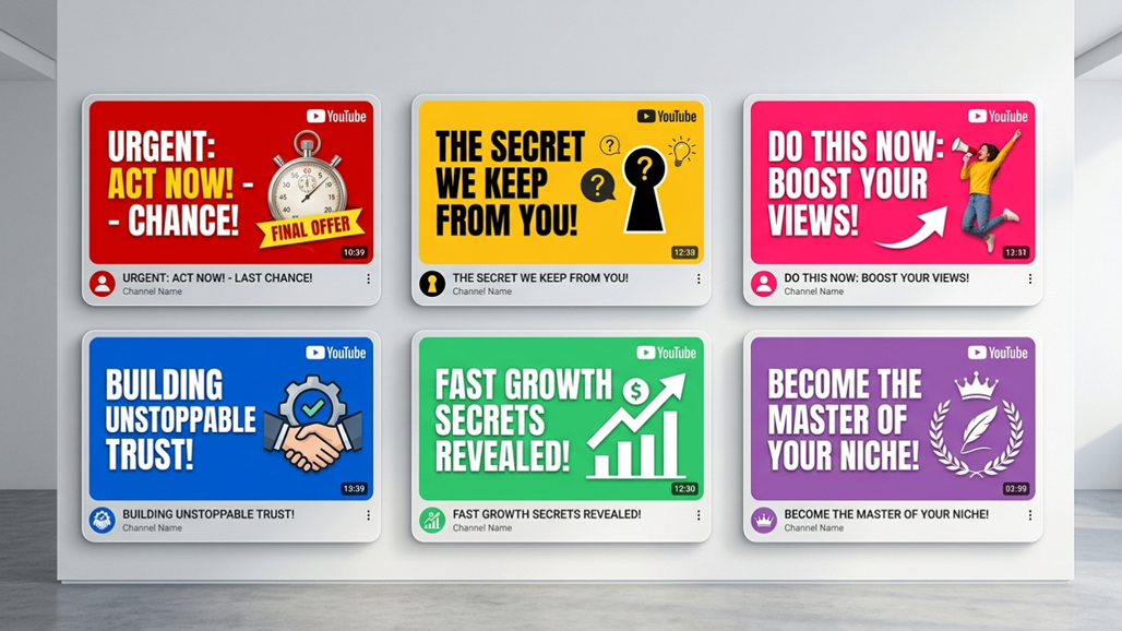
3. Never Use More Than 3 Words
Viewers process thumbnails in under 0.5 seconds. Best performers use 1-3 words. Bold. Sans-serif. High contrast. 'I LOST $10K' beats 'My Expensive Mistake That Cost Me Ten Thousand Dollars.'
4. Design for Mobile First
Over 70% of views happen on mobile. Test at 150px wide. If text is unreadable and subject unrecognizable, redesign.
5. The Arrow, Circle, and Hand Trap
Red arrows. Yellow circles. Pointing hands. They feel cheap but work. They direct eye movement toward the focal point.
6. Match the Thumbnail to the First 5 Seconds
Clickbait kills channels. Curiosity gaps build empires. Your thumbnail should promise something the video immediately starts delivering. Match the emotional contract.
7. Test Before You Commit
Upload a private video with two thumbnail variants. Run as YouTube ads with small budget. See which CTR wins. Or use TubeHunt to see which styles are dominating your niche.
How Faceless Creators Can Compete Without a Face
Your strategy shifts from 'personality' to 'visual intrigue.' Before/after splits, numbers and data ('$0 to $5K in 30 days'), object storytelling, and dark mode aesthetics with neon accents all work brilliantly. Invest in thumbnail design as heavily as scriptwriting. It's half the battle.
Want to see which thumbnail styles are dominating your niche right now? Explore TubeHunt and reverse-engineer the top performers before your next upload.